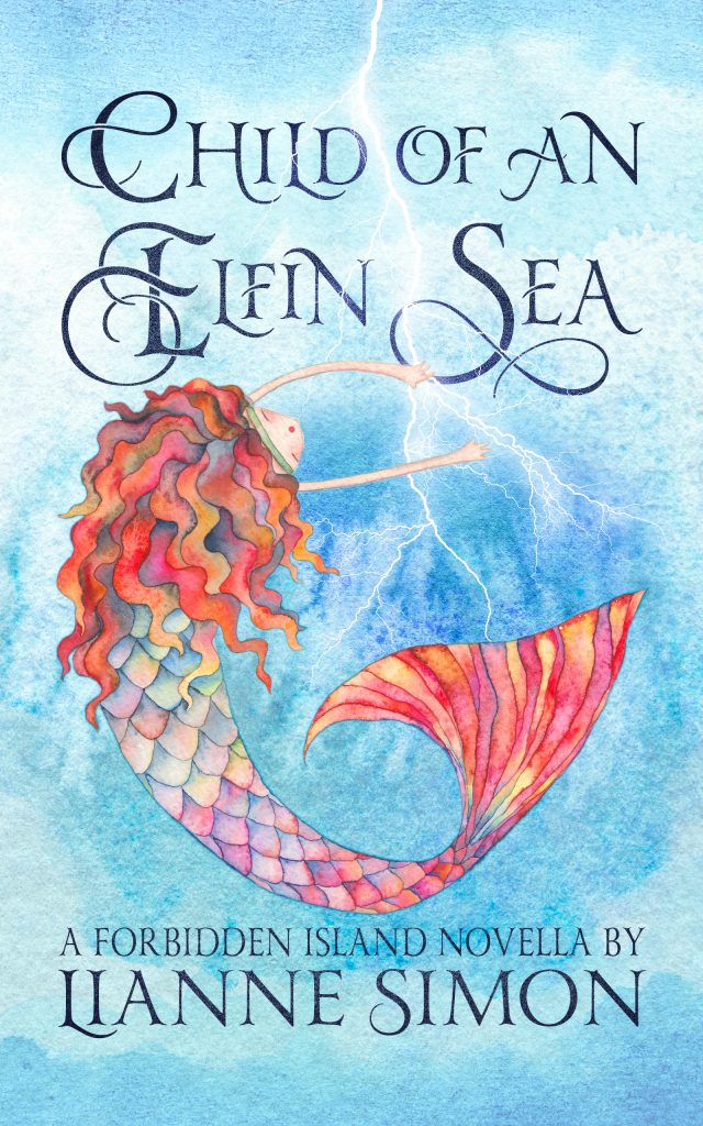
I spend almost as much of my time on cover design as I do writing. And I enjoy it nearly as much. The design for the cover of Child of an Elfin Sea began when I ran across a watercolor mermaid by the same artist who did the watercolor that appeared on my Short Story Outsider.
After thinking about ways to build a cover from the image, I decided that the image was too busy as it was. So, I extracted the mermaid from the background.
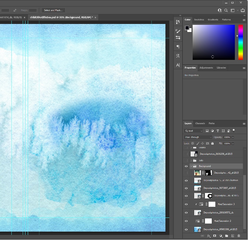
For a background, I look for an image that can cover the entire book. That way, I’m not left with a line on either edge of the spine.
But first, I format the interior well enough to get an idea of page count. Then I go to bookow to generate a template. I generally use 6″ x 9″.
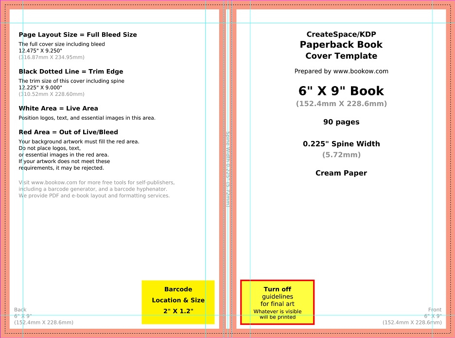
I add guides at 0.5 inches from the crop lines and 0.5 inches from the spine. They help me position images more easily.
For a background, I chose a blue water color to go with the watercolor mermaid. It was too dark and too saturated, so I altered it a bit.
I like object book covers, and they tend to be popular in Fantasy. There’s another reason, though, I think. Object covers are a little easier to build because you generally don’t have to overcome busy areas where you want to place title and author text.
To focus better on the area where I would add the mermaid, I added two layers. The first was a circular watercolor, the second a watercolor that looked a bit like coral. Then I added more watercolor details to the top and bottom of the image.
For me, cover design isn’t a linear process. I went through several iterations for the mermaid object and the field around her. For now, I want to look at what I did to add text.
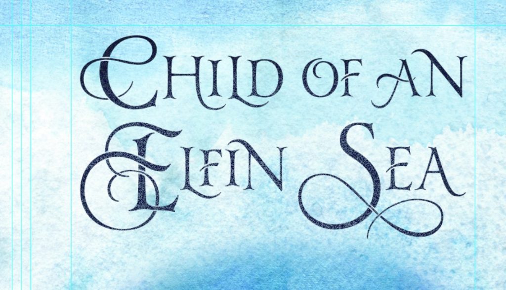
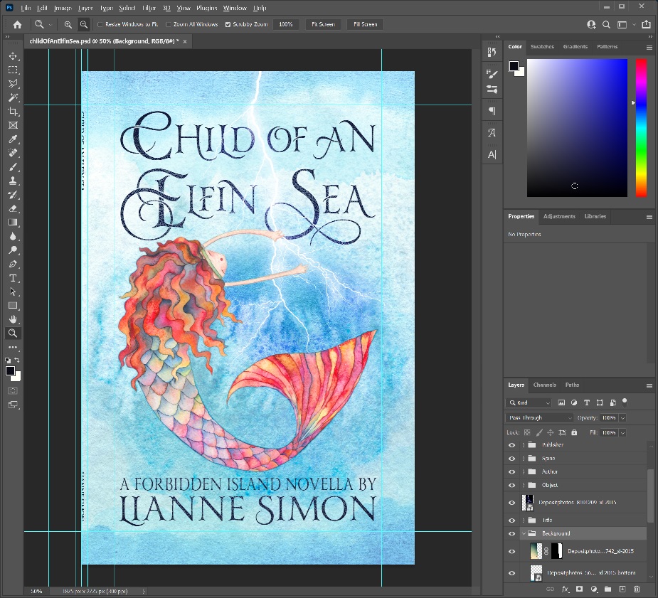
Child of an Elfin Sea is Fae Fantasy. Although the title may convey that, the genre tends to use more fanciful fonts that you might see on a Mystery. I use Yana quite a bit. It’s versatile and has a wide variety of embellished characters.
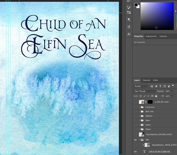
Finding the individual characters, sizes, and offsets that I wanted took me weeks. One of the few shortcomings of the Yana font is that not all of the embellished characters are the size that you might expect. So it takes some adjustment.
The title looks okay in black, but I wanted it to appear as though it’s in the sea mist. Yeah. That. So I added a layer to add texture to the font.
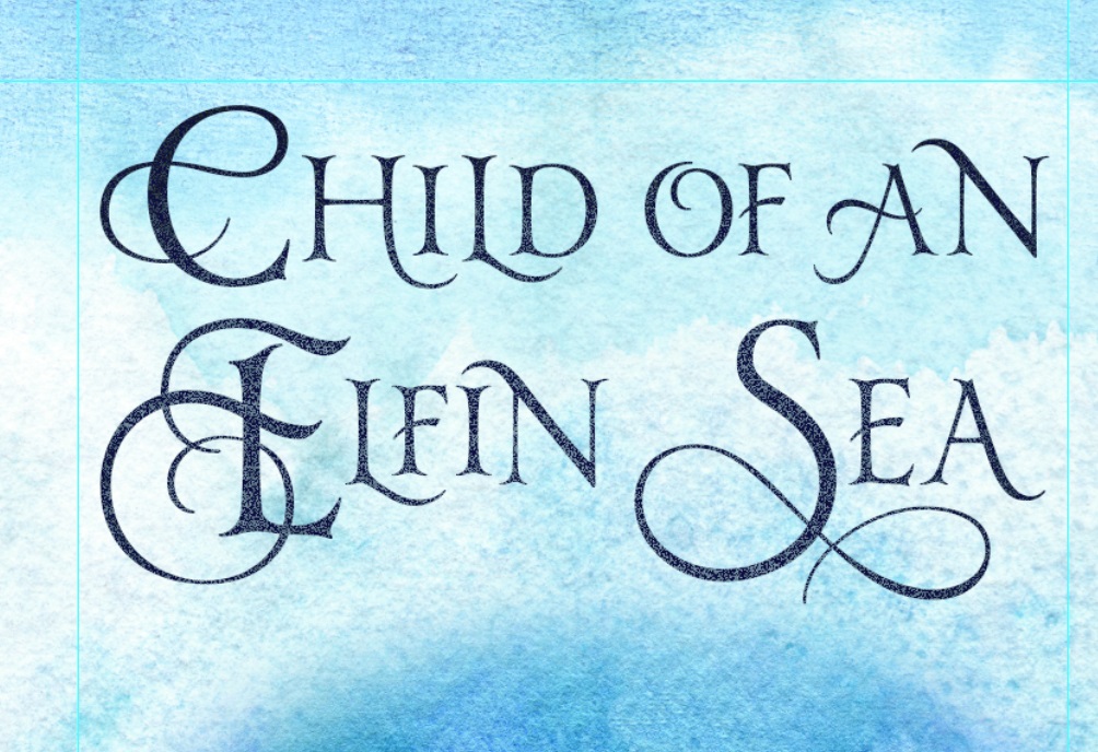
Last of all, I wanted to add a little more depth by having some of the swashes appear to go in front of the rest of the character. Or behind it. I added those by painting a mask that allowed parts of the background to show through. Note that the blue guides help keep the text centered on the front cover and equidistant from the edges.
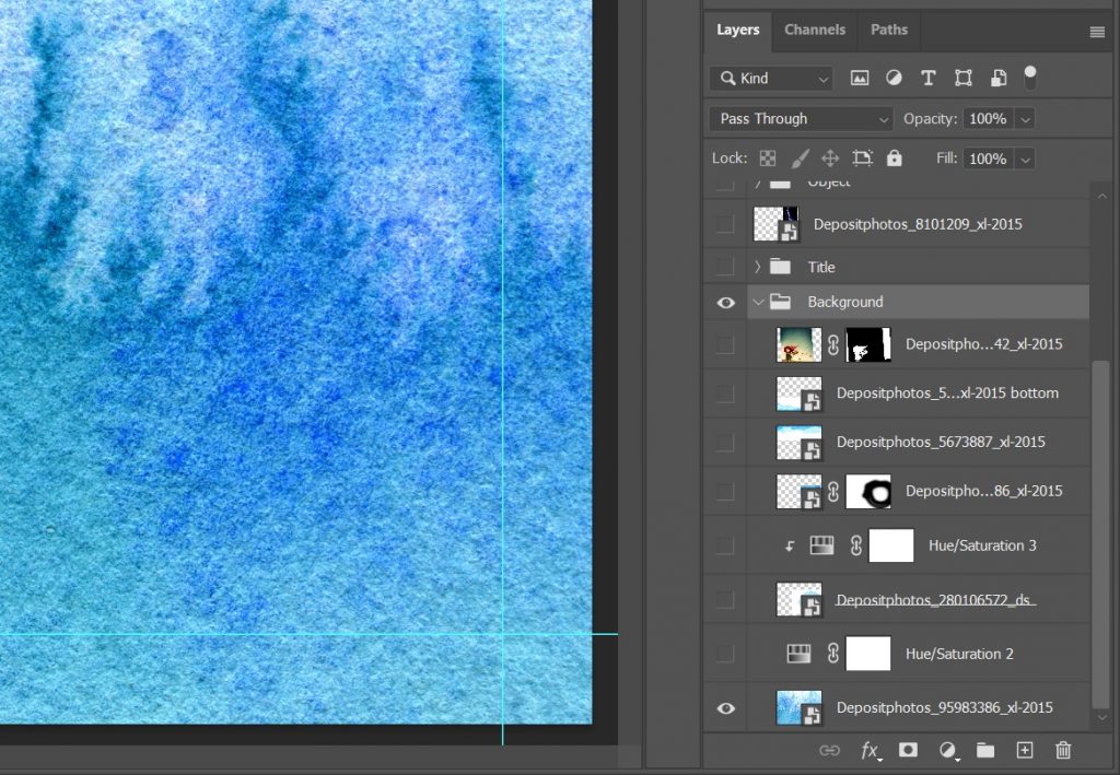
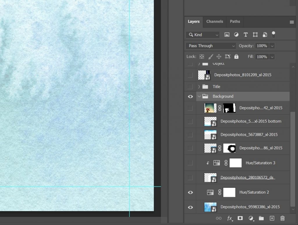
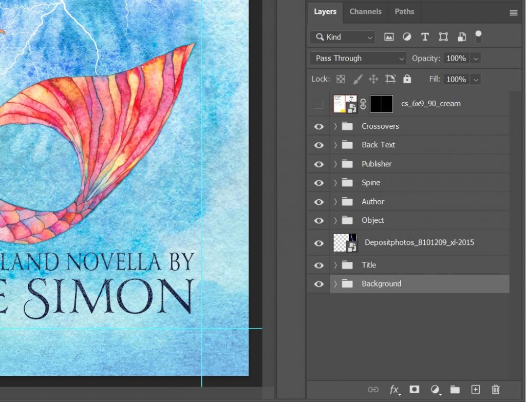
When I’m working on a cover, it’s easy for a layer to become lost in the stack. So I group those that I can–Background, Title, Author, Spine, etc. The exceptions are the single layers that I need to position individually.
After adding the mermaid, I adjusted its brightness and color saturation to better coordinate with the background. And I adjusted the background color to fit the mermaid’s colors.
I decided to place the mermaid in front (or on top) of the title text. To add a little conflict. Then, since I also added a lightning strike, I added it in front of the title text but behind the mermaid.
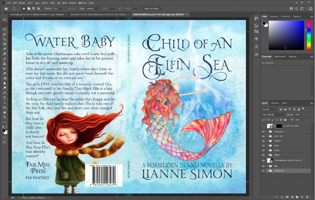
On the back cover, I generally add an additional subtitle above the blurb. Then the size of the blurb, along with the usual publisher information (press, genre, isbn barcode) determines what else I’ll add to the back cover. In this case, I wanted to add a little more whimsy.
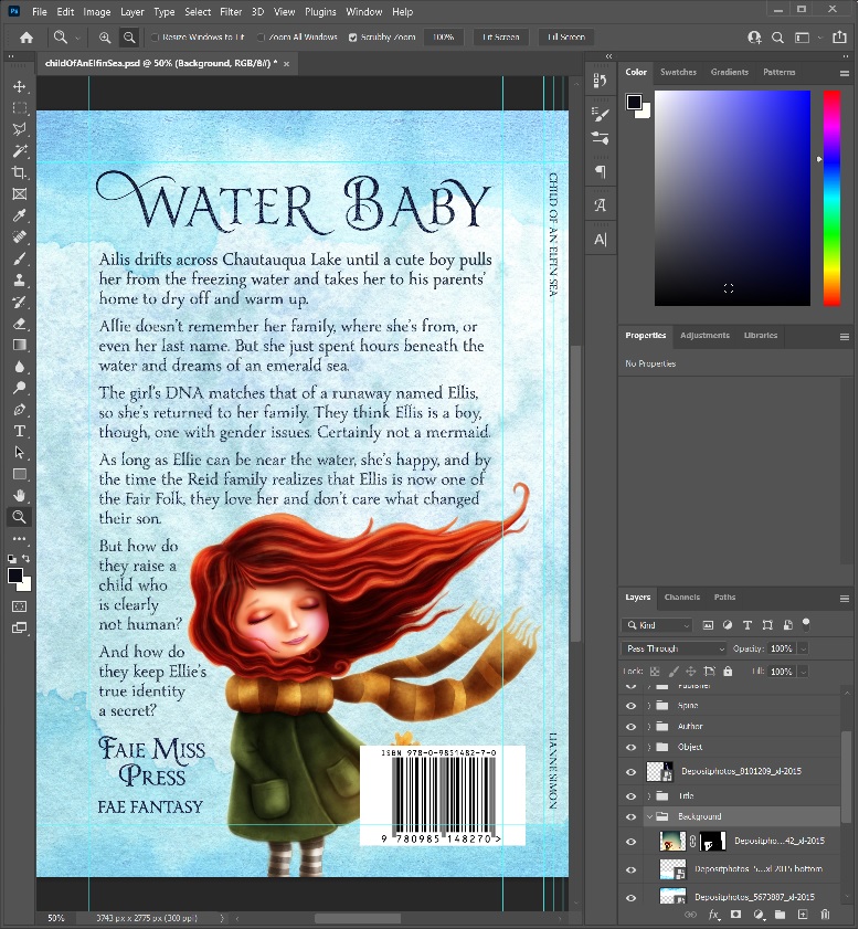
The blurb can be as difficult to get right as the rest of the book. Then you have to blend the text and whatever back cover image(s) you use. I ended up adjusting the image size, the text character size, and the layout quite a few times before it felt balanced.
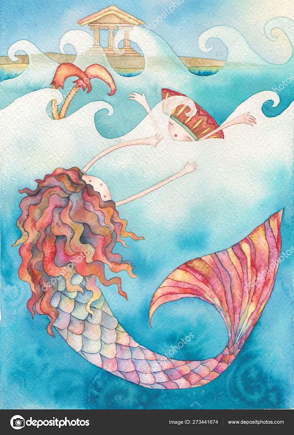
The back cover object image of the girl in the wind was easier to mask than the mermaid because of the relative simplicity of the image’s background. It didn’t require building a second file. Fortunately, the back cover object image didn’t require any color adjustments.
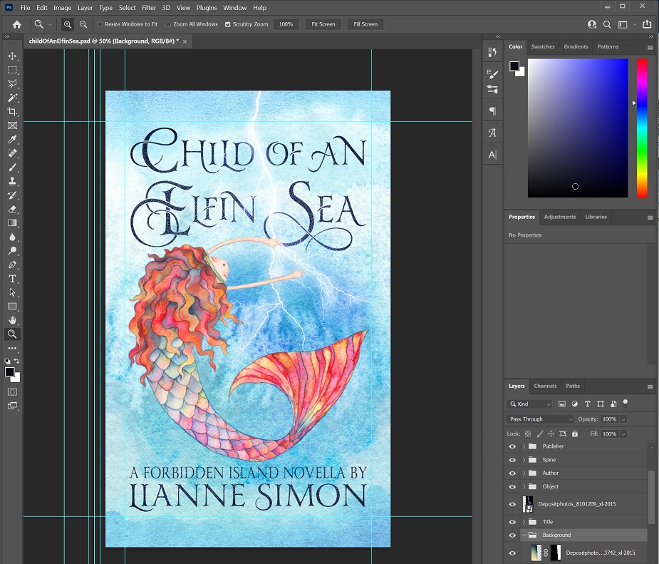
To get from paperback cover to ebook cover, I clip the image to 6.25″ x 9.25″, keeping the rightmost area. Note that part of the spine text remains.
Then I resize the image so that the height is 2560 pixels, the preferred ebook cover height. That results in an image width of 1730. The preferred width is 1600, so I crop to that width. That removes the spine text and leaves the front cover image centered.
It would be nice if I could design a book cover without quite so many iterations. The process I just described was the result of months of image selection and manipulation, and text sizing and placement. I even changed the title to see how that might work out.
If you create your own covers, don’t be afraid to experiment and to keep trying out different methods and ideas. Even if it takes forever, you’ll likely have fun doing it.
This is lovely. 🙂 i like finding out how things are made… it increases my appreciation of them.