Creating the files
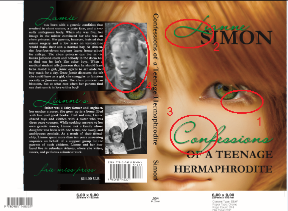
In Creating a DIY book cover with GIMP, I built the file for a book cover for Confessions of a Teenage Hermaphrodite. Before sending it off to the printer, I wanted to make sure it was perfect. It wasn’t.
Doing a poster proof
The file I send my printer is dimensioned 15 inches by 12 inches. A Google Maps search led me to a suburban Atlanta printer who charges $1 for quantity one 14×11 prints from digital.
My cover is only 12.8 inches by 9.25 inches. So I made a copy of my file, trimmed it down to 14×11, and centered the cover on a white background. The fancy color copiers are actually similar to the POD presses.
On the monitor the cover looked great, even when inspecting it close-up. However, when I got my proofs back, some flaws were evident.
- I had swapped out the eyes in the photo. The lower lids didn’t look right.
- At full size, the drop shadows didn’t look right.
- The contrast was insufficient.
- The photo was blurry.
Although I liked mixing fonts and font colors on the cover, the results, when printed and viewed actual size, weren’t what I expected. After trying various colors and modifying the background several times, I gave up and moved on.
When I started designing my cover, I was going to use a font that reminded me of Celtic runes. So, I started playing with it again. To overcome the issues with color and drop shadow, I eliminated both and went with a simpler layout.
Kern your title
One of the secrets that Cathi Stevenson lists in her Ten Secrets of Professional Book Cover Designers is kerning. Simply put, it’s adjusting the spacing between characters. I’ve marked below where I need to reduce the spacing.
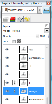
To change the spacing on ‘of a Teenage’, I duplicated the layer three times and removed the excess characters. So my text layers had ‘of”, ‘a’, ‘T’, and ‘eenage.’ The yellow box in the photo indicates that focus is on the ‘eenage’ text layer. The horizontal blue line is a guide I aligned with the top of that box. Since I have ‘snap to guides’ turned on, I can slide ‘eenage’ back and forth along the blue line without getting out of vertical alignment.
I started by adjusting the spacing between ‘T’ and ‘eenage.’ In the Layers/Channels/Paths window, I chained ‘T’ and ‘eenage’ and made sure the rest were unchained. That allowed me to move ‘Teenage’ as a unit while adjusting the spacing between ‘Teenage’ and ‘a.’
Plan B
I ended up changing the design substantially. Again.
CMYK Proofs
The last step in my workflow is RGB to CMYK conversion. GIMP will edit CMYK files, but you may not get the colors you expect.
This time the proofs looked reasonable, but I’m sure I’ll revise the cover again before it’s all over.


